
Tod Worner, the Managing Editor of the Evangelization & Culture journal of the Word on Fire Institute, had the opportunity to sit down with Word on Fire’s Art Director Michael Stevens to discuss his original painting, The Pentecost. This conversations first appeared in Evangelization & Culture, Issue XI, “The Four Last Things.” The following is Part I of their discussion.
Tod Worner: Michael, it is a pleasure connecting with you again. The last time we spoke was surrounding your exquisite design work with Nic Fredrickson on the newly-released Word on Fire Bible (see Evangelization & Culture, Issue IV, Summer 2020). You are now serving in your new position as Art Director for Word on Fire. Welcome to the team!
Michael Stevens: Thank you, Tod! I’m so excited to be an official part of Word on Fire. So much has happened since we last discussed Volume I of The Word on Fire Bible: My wife and I have welcomed two little ones, Volume II of The Word on Fire Bible has just been sent to the printer, and I’ve begun this exciting new chapter as a full-time member of the team. It’s been a season of amazing abundance—that God would reveal his presence in my life in such richly varied ways over such a short period of time has truly been overwhelming.
TW: You have told us before that you have always loved art and even studied painting at the School of the Art Institute of Chicago (SAIC). During your first year, your path decidedly changed. Could you tell us about what happened?
MS: As I started art school at SAIC, I felt sure that I would be studying painting all the way to the graduate level, and from there hopefully show my work in galleries and potentially pursue teaching to supplement that. For those few who manage to make a successful career in fine art, it’s the standard path: get your MFA, land a steady teaching position, and find a gallery that will represent and support your studio practice.
As my classes progressed at SAIC and I met people studying in other departments, though, I found I became increasingly interested in design-based disciplines. I considered switching to industrial/product design but eventually wound up on a graphic design path. I’m happy to have made that switch. Graphic design is, in so many ways, very similar to painting. Instead of working with wet paint on canvas, though, it’s ink and pixels on a printed page or LCD display. As I alluded to before, there’s also a level of flexibility and precision possible in graphic design that I’ve come to appreciate as a real advantage. When working digitally, revisions can be made with a few simple clicks of the mouse, whereas if you want to revise a painting, you’ll not only spend exponentially more time doing it, but you’ll also waste expensive paint in the process.
Perhaps on a deeper level than that, though, I learned through my pivot to graphic design that there’s a special power when words and images are combined. Really, that’s what the essence of graphic design is: the art of pairing words and images together and answering the complex questions that arise within that process. If you think about a project like the Word on Fire Bible, all the details of the book design had to answer the same simple question: “How can the text and images speak together more powerfully?” Of course, one realizes very quickly that the moment any text is paired with an image, the two become almost inextricable conceptually: words shape the way we see images, and vice versa. Even the literal shape of the words—the design of the individual letterforms that make up the word—exerts a force on the reader. So the craft of design becomes about maximizing the effectiveness of that word-image interplay. Needless to say, if I had stuck with painting from the start, I would probably never have moved beyond the realm of images into the domain of text and typography. What really catalyzed this for me was when we designed the Angelico typeface for the Bible: it was both an exercise in reading words (fonts are, after all, designed to be read, not simply seen) and an exercise in drawing and image-making with respect to the visual shape of each individual letter.
How can the text and images speak together more powerfully?
TW: Having formally been educated in graphic design, you have never lost your love for placing brush to canvas. What has been your experience in painting over the years?
MS: It’s been a process of joyful rediscovery. In high school, I went through a phase when all I wanted to do in my free time was paint—sometimes to the point of staying up into the wee hours of the night in my basement art studio when I should have been sleeping. In college, this passion for painting eventually evolved into a much broader interest in art and design as I was encouraged to dabble in completely unfamiliar media like digital design software, sculpture, and photography. As I came to appreciate more fully the range of tools available to artists today, it started to radically change how I think about painting as a discipline. Rather than seeing painting as the definitive method of making images, I came to see it as one mode among many others. Like photography or book design, its materials and formal vocabulary (in this case, canvas, pigment, brushstrokes, two-dimensional surfaces, etc.) speak in their own particular way and evoke a particular historical background. Having at this point explored a range of creative disciplines outside of painting, I’m much more appreciative of what painting offers in particular, both as an artist and as a viewer.
From the first-person perspective of actually working with paint, there’s nothing quite like the feeling of scraping butter-smooth oils across the gritty surface of a freshly-primed canvas, or the nutty smell of linseed oil in the studio along with your morning coffee. There’s a special joy in the tactility of the materials themselves, and I’m more appreciative of that, having spent so much time in the digital space, where everything is mediated by a mouse and keyboard. The more I look at great paintings, too, the more I sense how that tactility can translate to the viewer’s side of the experience as well. There’s a unique power in knowing that a painted image is the physical artifact of hours of labor, a huge mosaic of thousands of once-wet brushstrokes. Digital tools—for all the convenience and precision they offer—tend to strip some of that vitality and immediacy out of both the making and viewing experience.
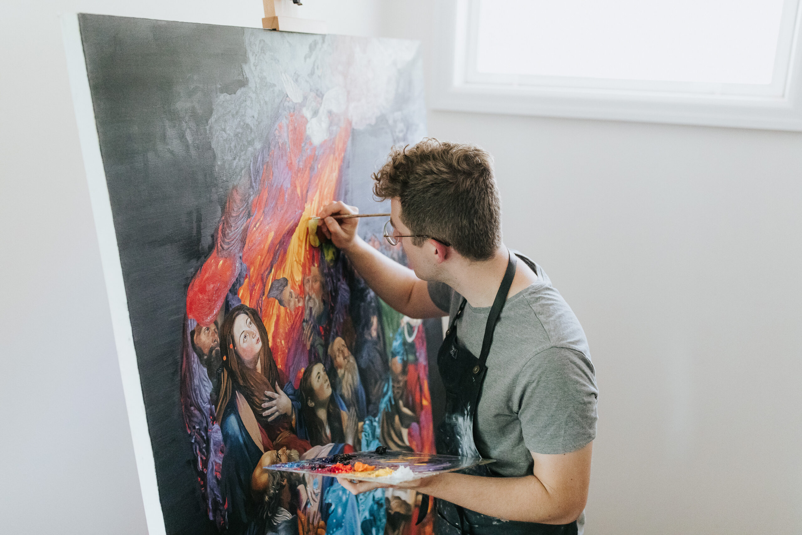
TW: Let’s talk about your most recent undertaking, The Pentecost. What inspired you to craft such a masterwork?
MS: The idea for The Pentecost actually came directly from a seventeenth-century painting I stumbled across when choosing artwork for Volume II of the Word on Fire Bible: Acts, Letters, and Revelation. While I was exploring possibilities for artwork to pair with the second chapter of Acts (the story of Pentecost), I came across a piece by Juan Bautista Maíno, a Dominican friar and master painter of the Spanish Baroque era. His work (also titled The Pentecost) depicts the Apostles in the Upper Room in a style heavily influenced by the Italian master Caravaggio. Seeing this painting at this particular time, for whatever reason, prompted a lot of reflection about how the passage of time affects the way we look at these kinds of historical works of sacred art. I thought about how radical Caravaggio’s (and, by extension, Maíno’s) style must have been to his peers: on the one hand, it was greatly indebted to the best traditional techniques of his day, but on the other hand, it was almost entirely visually unprecedented. I think of Caravaggio’s paintings as something like the early-seventeenth-century equivalent of today’s avant-garde fashion photography—utterly obsessed with the aesthetics of newness. The piercing lighting, the laser-focused clarity of the brushwork, the hyperrealism of the figures—it must have all seemed so new to a Rome still on the heels of the classicism of Michelangelo and Raphael.
This prompted me to imagine what might happen if this piece by Maíno—which, thanks to its Caravaggesque style, would have looked so fresh and new in its day—were transplanted into the twenty-first century and made to look new once again. Then came the idea: I would use digital graphic design techniques to collage the original Maíno painting together with other found images to make something truly contemporary while remaining true to traditional notions of craft. All of the images that comprise the painting are—technically speaking—found images, but together they form an image of Pentecost that is entirely different in character and atmosphere from the original Maíno work.
I’m hoping this decidedly new rendition of Pentecost reminds people that the Holy Spirit is always working here and now. He is not confined to any single moment in history, but is rather continually revealing the person of Jesus to the Church across time. Furthermore, I hope that it reminds people that the Catholic tradition of art has always embraced beauty both old and new. The great treasures of the Catholic canon of art may look—for all their splendor—a bit antiquated to our eyes today, but at the time of their creation, many of them would have exuded a stylistic hunger for innovation and newness. The Church, while holding fast to the truth, wholeheartedly affirms the artist’s quest for novel revelations of God’s beauty. I wanted to celebrate that fact with The Pentecost, while at the same time avoiding frivolous experimentation and strangeness for its own sake.
I think sometimes Catholics can tend toward an exclusively retrospective view of art for fear that new artistic methods in sacred art inherently imply a desire to reinvent the faith on a theological level. But sacred art that is truly innovative (that is, both innovative and truth-oriented) never attempts to change the fundamental truth it expresses. The beauty of God-given human creativity is precisely in its mysterious ability to capture the stable, unchanging goodness of God in such varied and dynamic ways. To use an analogy, to see a sculpture from a new point of view or in a new light does not imply the sculpture itself has changed. Rather, to borrow an insight from Newman, we come to grasp the thing’s stable, external objectivity (in this case, the sculpture’s position in space) more firmly for having seen its multiple aspects.
TW: Beginning at a technical level, what exactly goes into creating such an extraordinary work? How much time does it involve?
MS: I had never made a painting quite like The Pentecost, so a lot of research had to be done in advance. I knew I wanted the painting to be, like the Maíno, a large-scale oil painting, so I opted for the size of 4’ × 6’. The original, believe it or not, is considerably larger, but I figured 4’ × 6’ was the largest I could reasonably do given the size of my workspace. To be perfectly honest, I wasn’t sure that what I had envisioned would be possible. The first sketch that I did in Photoshop—which was really just a crudely-assembled composite of overlapping photos—had a feeling of digital vividness and hyper-reality that I wasn’t sure would translate to traditional media persuasively. Because of this, I started by painting a 12’’ × 12’’ study, which I used as a glorified piece of scratch paper for testing out colors, brushes, paint consistencies, etc. Eventually, after about two months of trial and error at a smaller scale, I felt ready to move to the large canvas.
Since I had created the image in the computer already as a proof-of-concept, the main concern became how to reproduce the image as exactly as possible as oil on canvas at its final 4’ × 6’ scale. I knew that the process needed to be controlled at every stage if I was to manage the level of detail, especially in the areas of lava. After researching other painters working in a detailed style, I determined step one would be to create a simple line drawing on the canvas’ surface to mark out the position of the painting’s main figures and shapes. I created this by hand-sketching the linework on a digital pen tablet (similar to an iPad). At this stage I didn’t shade, as my goal was simply to delineate the individual shapes that comprised the composition. This “blueprint” of linework was then printed off at the actual size of the canvas by a commercial printer, then offset on the canvas surface in oil paint using what’s known as an oil transfer technique. At the end of this process, I had transferred what was originally a small drawing of the figures’ outlines onto the surface of the blank, full-size canvas.
Step two involved filling in this oil-painted line drawing with a detailed black-and-white underpainting, also in oil. This would act as a highly detailed reference “drawing” for later layers of color on top. By removing color from the equation during this step, I would be able to focus exclusively on the positioning of the shapes that make up the image. This was by far the most time-consuming step of the process, as it involved transforming the canvas from a bare-bones line drawing to a nearly photorealistic painted image. To assist in this process, I printed out a huge number of reference images and color breakdowns based on my original photo collage on the computer. This helped a lot in determining how best to recreate everything in black and white oil paint.
Once the black-and-white underpainting was complete, step three involved a somewhat simpler process to repaint the image in color—it was more or less a matter of mixing the right color and pinning it to the right shape. Even so, I’ve always found color mixing to be a tricky process. The margin between a color that’s spot-on and a color that’s inexplicably “off” is finer than you might think, so there was quite a bit of revision involved in this phase.
And lastly, step four, and the one I most underestimated in terms of difficulty, was photographing the finished piece for inclusion in the pages of the Bible. Because I was working on the Bible on the design side as well, I needed to find the best way to capture this massive canvas so it could be laid out in the book itself. This involved stitching together twenty-one separate snapshots of the painting to form the final photograph in the book, which wound up being an image over 18,000 pixels tall.
In total, I would guess this whole process—from the small-scale study painting to the finished painting’s photography and layout in the Word on Fire Bible—took around five hundred hours.
Tomorrow, we will conclude with Part II of Tod Worner’s conversation with Michael Stevens. You can watch the full “The Pentecost” film here, presenting a glimpse into Michael’s process, his inspirations, and the masterful work itself.